Plot a violin plot
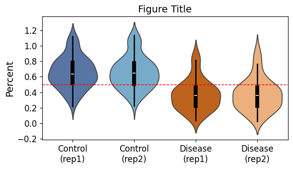
Define var and update sample_info dictionary according to your dataframe to use this code. This code will also show statistics (count, mean, std, min, quartiles, max) of your data.
The violin plot:
import time
import pandas as pd
print("pandas: " + pd.__version__)
import seaborn as sns
print("seaborn: " + sns.__version__)
import matplotlib
import matplotlib.pyplot as plt
# embed plots in notebook
%matplotlib inline
print("matplotlib: " + matplotlib.__version__)
print(time.strftime("%Y-%m-%d"))

fig_title="Figure Title"
path= "/path/to/the/directory/for/plots"
fig_name=f'{path}/violin.png'
print(fig_name)

# Define sample info with readable names and colors
sample_info = {
    "ctrl_rep1": ("Control (rep1)", "#4C72B0"),  # blue
    "ctrl_rep2": ("Control (rep2)", "#6BAED6"),  # lighter blue
    "mut_rep1": ("Disease (rep1)", "#D95F02"),   # orange
    "mut_rep2": ("Disease (rep2)", "#FDAE6B"),   # lighter orange
}

var="variable"

# Melt dataframe
melted_df = violin_df.melt(
    id_vars=[var],
    value_vars=list(sample_info.keys()), # use keys from the dictionary
    var_name='Sample',
    value_name='Percent'
)

# Drop NaNs
melted_df = melted_df.dropna()

# Map readable names
melted_df['Sample'] = melted_df['Sample'].map({k: v[0] for k, v in sample_info.items()})

# Define plotting order and palette
sample_order = [v[0] for v in sample_info.values()]
custom_palette = {v[0]: v[1] for v in sample_info.values()}

# Plot
plt.figure(figsize=(6, 3.5))

# Violin plot
sns.violinplot(
    x="Sample", y="Percent", data=melted_df, order=sample_order,
    palette=custom_palette, inner="box", inner_kws={"color": "black"}
)

# Add horizontal line
plt.axhline(0.5, color='r', linestyle='--', linewidth=1)

# Compute summary statistics
summary_stats = melted_df.groupby('Sample')["Percent"].describe().reset_index()

# Replace spaces with line breaks in x-axis labels
ax = plt.gca()
new_labels = [label.get_text().replace(' ', '\n') for label in ax.get_xticklabels()]
ax.set_xticklabels(new_labels)

# Titles and labels
plt.title(fig_title, fontsize=14)
plt.xlabel("", fontsize=14)
plt.ylabel("Percent", fontsize=14)
plt.xticks(fontsize=12)
plt.yticks(fontsize=12)
plt.tight_layout()

# Save the plot
plt.savefig(fig_name, bbox_inches = 'tight', format = 'png', dpi=300)

# show summary statistics
display(summary_stats)
plt.show()