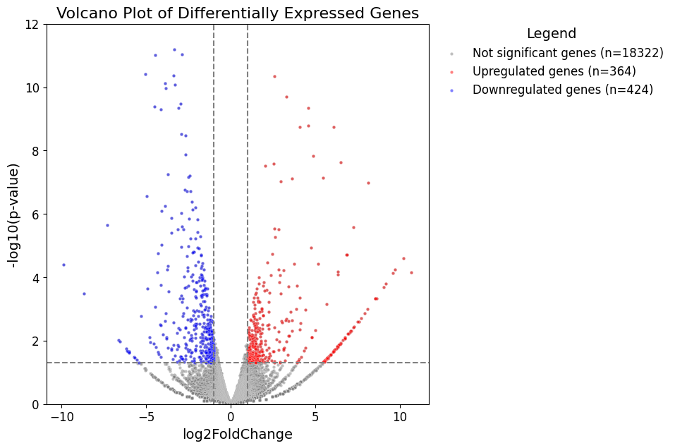
Plot a volcano plot
This code looks for the columns 'gene_name', 'pvalue', 'log2FoldChange' in the dataframe.
The volcano plot:
import time
import pandas as pd
print("pandas: " + pd.__version__)
import numpy as np
print("numpy: " + np.__version__)
import seaborn as sns
print("seaborn: " + sns.__version__)
import matplotlib
import matplotlib.pyplot as plt
# embed plots in notebook
%matplotlib inline
print("matplotlib: " + matplotlib.__version__)
print(time.strftime("%Y-%m-%d"))

fig_title="Volcano Plot of Differentially Expressed Genes"
path = "/path/to/the/directory/for/plots"
fig_name=f'{path}/volcano.png'
print(fig_name)

# Define thresholds
pvalue=0.05
logfc = 1

# Add -log10(p-value) column for plotting
degs_df["neg_log10_pval"] = -np.log10(degs_df["pvalue"])

# Filter for significant genes
pvalue_df =  degs_df[(degs_df["pvalue"] <= pvalue) & (abs(degs_df["log2FoldChange"]) >= logfc)]
sig_up = pvalue_df[pvalue_df["log2FoldChange"] > 0]
sig_down = pvalue_df[pvalue_df["log2FoldChange"] < 0]

# Plotting
fig, ax = plt.subplots(figsize=(7, 7))

dot_size=10

# Plot each group of genes
group0_title=f'Not significant genes (n={len(degs_df)})'
sns.scatterplot(data=degs_df, x='log2FoldChange', y='neg_log10_pval', alpha=0.5, color='grey', label = group0_title, s=dot_size)

group_up_title = f'Upregulated genes (n={len(sig_up)})'
sns.scatterplot(data=sig_up, x='log2FoldChange', y='neg_log10_pval', alpha=0.5, color='red', label=group_up_title, s=dot_size)

group_down_title = f'Downregulated genes (n={len(sig_down)})'
sns.scatterplot(data=sig_down, x='log2FoldChange', y='neg_log10_pval', alpha=0.5, color='blue', label=group_down_title, s=dot_size)

plt.xlabel(f'log2FoldChange', fontsize=14)
plt.ylabel(f'-log10(p-value)', fontsize=14)
ax.tick_params(axis='both', which='major', labelsize=12)
plt.title(fig_title, fontsize=16)
plt.legend(bbox_to_anchor=(1, 0.9), loc='center left',
           title="Legend", title_fontsize=14, fontsize=12, frameon=False) # move legend
# loc options: 'best', 'upper right', 'upper left', 'lower left', 'lower right', 'right', 'center left', 'center right', 'lower center', 'upper center', 'center'

# draw horizontal and vertical dashed lines
yline = -np.log10(pvalue)
plt.axhline(yline, color='grey', linestyle='--')
plt.axvline(logfc, color='grey', linestyle='--')
plt.axvline(-logfc, color='grey', linestyle='--')

# Save the plot
plt.savefig(fig_name, bbox_inches = 'tight', format = 'png', dpi=300)

plt.show()