Track and Visualize Activity in Your PhD Vault
Activity visualization relies on tracking activity by adding information in the yaml frontmatter of your daily notes and later using plugins to consolidate the data and visualize it. You can track lots of things in different ways once you decide what and how to track it.
If you are not sure what a frontmatter is, read about it here.
What is Daily notes?
Daily notes is a core plugin that opens a note based on the date. It can be used to create journal, logs, notebook. For our PhD vault, we will be using it like a digital personal lab notebook. Our daily notes will be created from a template so it will automatically include the metadata we document on a daily basis.
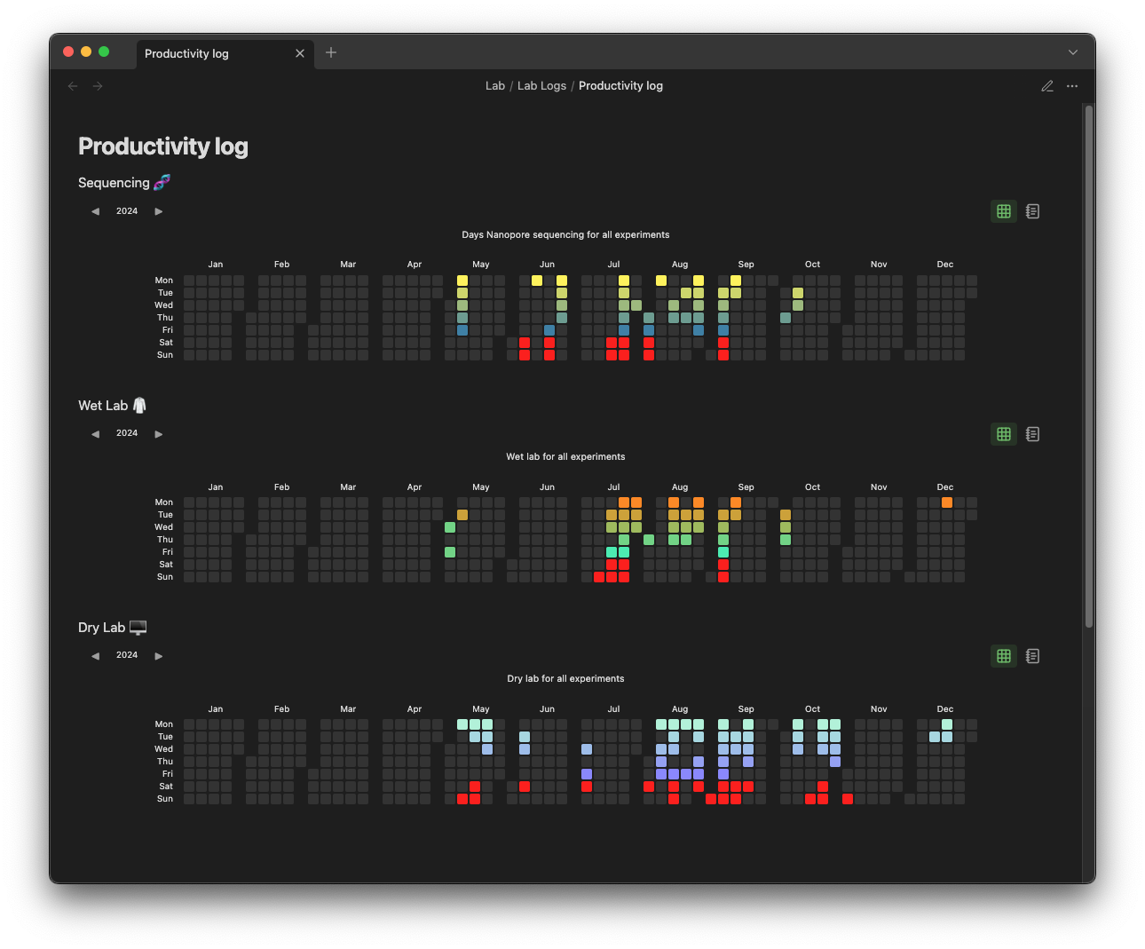
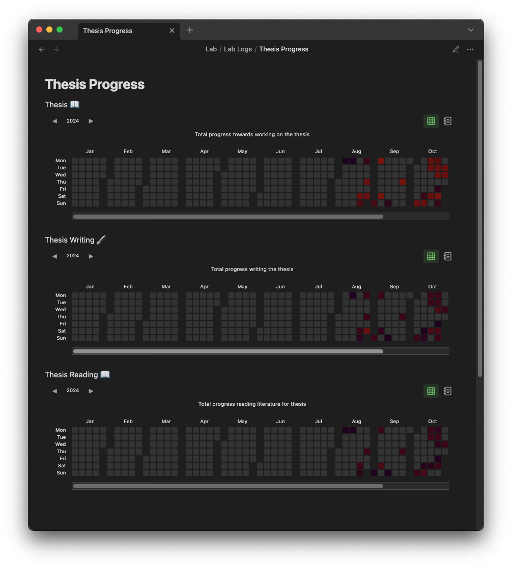
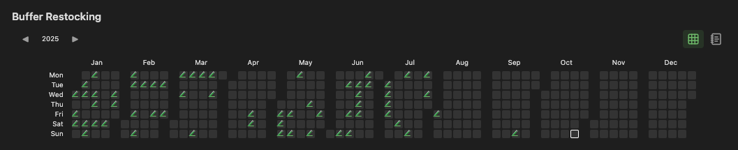
Heatmap-like visualization
This vault visualizes activity using the concept of a heatmap in a calender grid. A heatmap is a map or a grid that represents values using color intensity or color schemes. So combining the two results in a calender with a color scheme representing the activity we are tracking. This visualization is done with an Obsidian community plugin. At first HeatmapCalender plugin was used but then Heatmap Tracker plugin was recently implemented for these additional functions (as of October 2025):
- Separating the months for more convenient visualization
- Easily switching between each year with a click allows you to keep only note to visualize all activity.
- Quick click statistics tab.
Color gradients and palettes
For help picking color combinations to create interesting color gradients and palettes, I used the coolors website (not sponsored).
Different ways of tracking activity
Here are some of the ways this vault tracks various activities.
Calender Visualizations
Tracking with a weekly color gradient
 (explanation coming soon)
Tracking with duration for color gradient
 (explanation coming soon)
Tracking “check off” activities with icons
 (explanation coming soon)