Plot barplot-like timeline using Gantt chart
NOTE: You may also need to have the latest version of nbformat and kaleido installed.
import time
import warnings
warnings.filterwarnings('ignore')
import pandas as pd
print("pandas " + pd.__version__)
import plotly
import plotly.express as px
print("plotly " + plotly.__version__)

todays_date = time.strftime("%Y-%m-%d")
print(f'\nDate: {todays_date}')

df = pd.DataFrame([
  dict(Task="Task 1", Start='2026-06-26', Finish='2026-07-08', Resource="Color 1"),
  dict(Task="Task 1", Start='2026-04-26', Finish='2026-05-18', Resource="Color 1"),
  dict(Task="Task 2", Start='2026-05-06', Finish='2026-06-17', Resource="Color 3"),
  dict(Task="Task 3", Start='2026-08-03', Finish='2026-08-28', Resource="Color 1"),
  dict(Task="Task 4", Start='2026-06-22', Finish='2026-07-21', Resource="Color 2"),
  dict(Task="Task 5", Start='2026-07-22', Finish='2026-07-29', Resource="Color 3")
])

fig_title = "Task Timeline"
fig_subtitle = "Summer 2026"
path = "/path/to/the/directory/for/plots"
fig_name = f'{path}/Task_timeline_summer_2026.png'

# Create plot
fig = px.timeline(df, x_start="Start", x_end="Finish", y="Task", color="Resource")

fig.update_layout(
  title=dict(text=fig_title, x=0.5, xanchor="center", font=dict(size=20)),
  annotations=[dict(text=fig_subtitle, x=0.55, y=1.08, xref="paper", yref="paper", showarrow=False, font=dict(size=12))],
  xaxis_title="Date", xaxis_title_font=dict(size=16), xaxis=dict(tickfont=dict(size=12), tickangle=-25),
  yaxis_title="Task", yaxis_title_font=dict(size=16), yaxis=dict(tickfont=dict(size=12)),
  legend_title="Category", legend=dict(font=dict(size=12), title_font=dict(size=14))
)

# Plotly’s default is 72 px/inch.
dpi = 300
scale_factor = dpi / 72

# Save plot
fig.write_image(fig_name, scale=scale_factor)

fig.show()
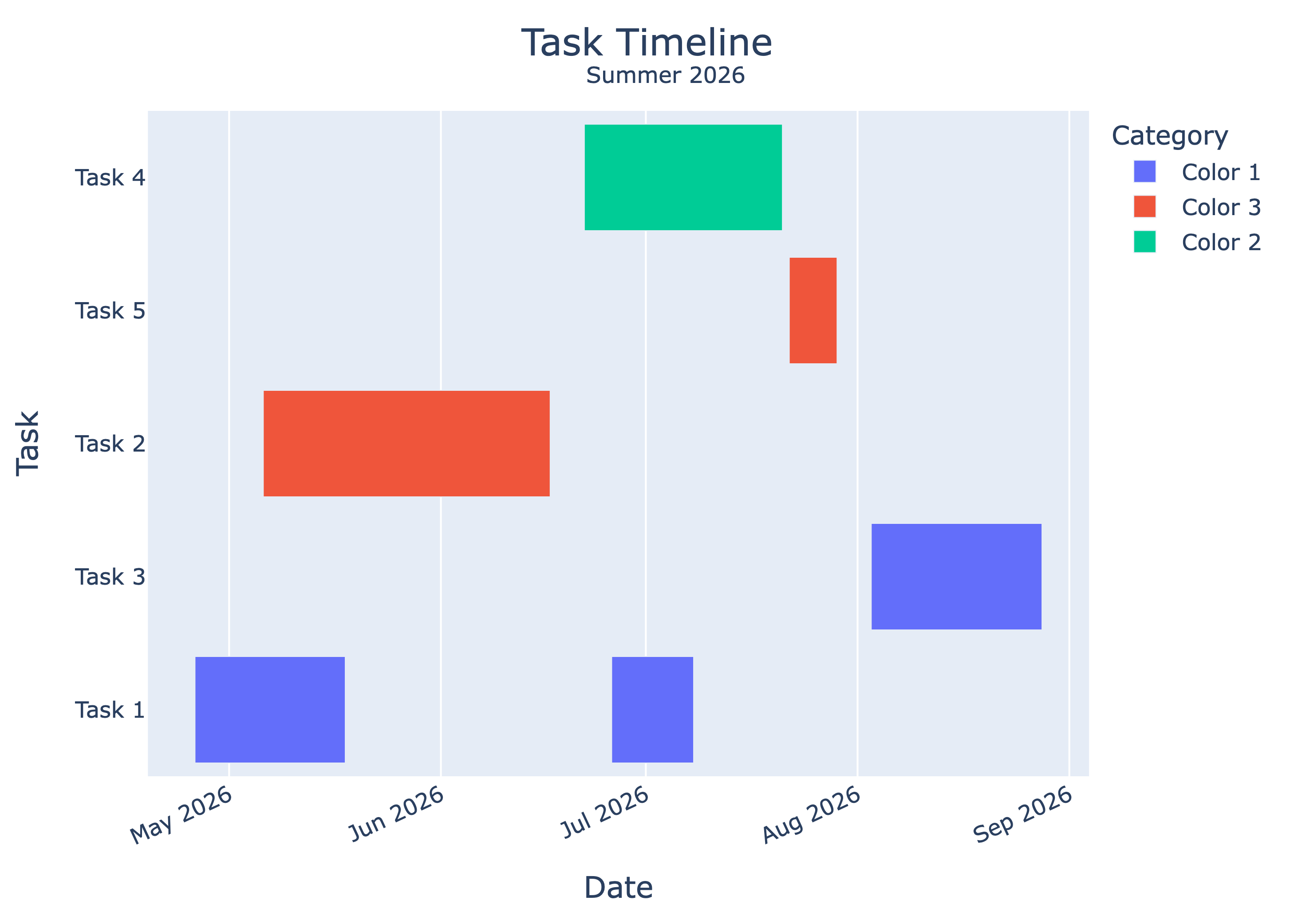
You might have noticed that the Tasks on the y-axis is sorted in a strange order. This is because by default, the y‑axis order is built by color first in the order they appear in the data, then by the first occurrence of each task within that color.
So in this example, it would be: Color 1 → Task 1, Task 1 (duplicate), Task 3 Color 3 → Task 2, Task 5 Color 2 → Task 4
Which gives the Task order: 1, 3, 2, 5, 4. Additionally, by default tasks are listed from the bottom up.
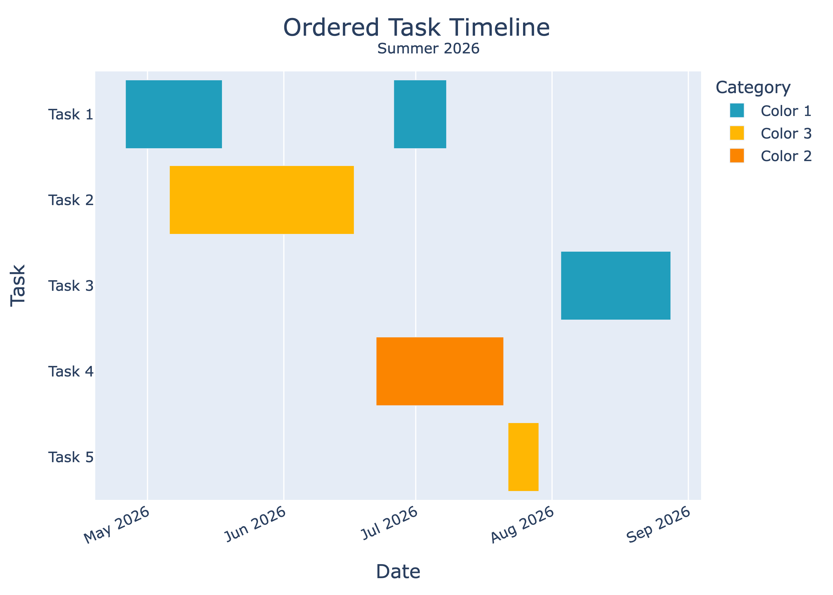
To override this, we must set an explicit order and reverse it. While we are at it, let’s override and define our own color scheme.
import time
import warnings
warnings.filterwarnings('ignore')
import pandas as pd
print("pandas " + pd.__version__)
import plotly
import plotly.express as px
print("plotly " + plotly.__version__)

todays_date = time.strftime("%Y-%m-%d")
print(f'\nDate: {todays_date}')

df = pd.DataFrame([
  dict(Task="Task 1", Start='2026-06-26', Finish='2026-07-08', Resource="Color 1"),
  dict(Task="Task 1", Start='2026-04-26', Finish='2026-05-18', Resource="Color 1"),
  dict(Task="Task 2", Start='2026-05-06', Finish='2026-06-17', Resource="Color 3"),
  dict(Task="Task 3", Start='2026-08-03', Finish='2026-08-28', Resource="Color 1"),
  dict(Task="Task 4", Start='2026-06-22', Finish='2026-07-21', Resource="Color 2"),
  dict(Task="Task 5", Start='2026-07-22', Finish='2026-07-29', Resource="Color 3")
])

fig_title = "Ordered Task Timeline"
fig_subtitle = "Summer 2026"
path = "/path/to/the/directory/for/plots"
fig_name = f'{path}/Task_timeline_summer_2026.png'

# Define the order
order = ["Task 1", "Task 2", "Task 3", "Task 4", "Task 5"]

# Set colors
resource_to_color = {
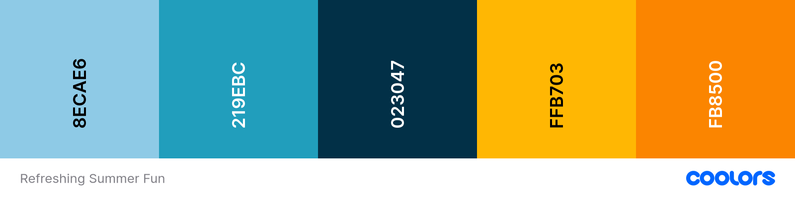
    "Color 1":"#219ebc",
    "Color 3":"#ffb703",
    "Color 2":"#fb8500" }

# Sort the df chronologically by Task and Start date, not strictly necessary
df = df.sort_values(["Task", "Start"])

# Set the order for the Task column
df["Task"] = pd.Categorical(df["Task"], categories=order, ordered=True)

# Create plot
fig = px.timeline(df, x_start="Start", x_end="Finish", y="Task", color="Resource", color_discrete_map=resource_to_color)

# Force the reversed direction (top‑to‑bottom) instead of default (bottom‑to‑top).
fig.update_yaxes(autorange="reversed")

# Explicitly pass the custom order to the y‑axis
fig.update_yaxes(categoryorder="array", categoryarray=order)

fig.update_layout(
  title=dict(text=fig_title, x=0.5, xanchor="center", font=dict(size=20)),
  annotations=[dict(text=fig_subtitle, x=0.55, y=1.08, xref="paper", yref="paper", showarrow=False, font=dict(size=12))],
  xaxis_title="Date", xaxis_title_font=dict(size=16), xaxis=dict(tickfont=dict(size=12), tickangle=-25),
  yaxis_title="Task", yaxis_title_font=dict(size=16), yaxis=dict(tickfont=dict(size=12)),
  legend_title="Category", legend=dict(font=dict(size=12), title_font=dict(size=14))
)

# Plotly’s default is 72 px/inch.
dpi = 300
scale_factor = dpi / 72

fig.write_image(fig_name, scale=scale_factor)

fig.show()
Coolors Palette: Refreshing Summer Fun