Plot a PCA plot
import time
import warnings
warnings.filterwarnings('ignore')

import matplotlib
import matplotlib.pyplot as plt
%matplotlib inline
print("matplotlib: " + matplotlib.__version__)

import seaborn as sns
print("seaborn: " + sns.__version__)

import sklearn
from sklearn.decomposition import PCA
print("scikit-learn version:", sklearn.__version__)

todays_date = time.strftime("%Y-%m-%d")
print(f'\nDate: {todays_date}')

sample_meta = {
    'g1_1': {"label": "Group 1 Set 1",  "color": "darkblue",     "marker": "o"},
    'g1_2': {"label": "Group 1 Set 1",  "color": "darkblue",     "marker": "o"},
    'g1_3': {"label": "Group 1 Set 2",  "color": "gold",         "marker": "o"},
    'g1_4': {"label": "Group 1 Set 2",  "color": "gold",         "marker": "o"},
    'g2_1': {"label": "Group 2 Set 1",  "color": "green",        "marker": "v"},
    'g2_2': {"label": "Group 2 Set 1",  "color": "green",        "marker": "v"},
    'g2_3': {"label": "Group 2 Set 2",  "color": "red",          "marker": "v"},
    'g2_4': {"label": "Group 2 Set 2",  "color": "red",          "marker": "v"},
    'g3_1': {"label": "Group 3 Set 1",  "color": "deepskyblue",  "marker": "s"},
    'g3_2': {"label": "Group 3 Set 1",  "color": "deepskyblue",  "marker": "s"},
    'g3_3': {"label": "Group 3 Set 2",  "color": "darkorange",   "marker": "s"},
    'g3_4': {"label": "Group 3 Set 2",  "color": "darkorange",   "marker": "s"},
}

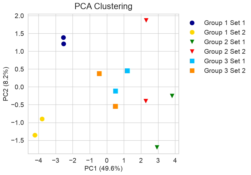
fig_title="PCA Clustering"
path = "/Users/jaz/path/to/the/directory/for/plots"
fig_name=f'{path}/pca.png'
print(fig_name)

pca_input = df.T
pca = PCA(n_components=2)
pca_result = pca.fit_transform(pca_input)

pca_df = pd.DataFrame(pca_result, columns=["PC1", "PC2"])
pca_df["Condition"] = pca_input.index.map(
    lambda x: sample_meta[x]["label"])

palette  = {info["label"]: info["color"] for info in sample_meta.values()}
markers  = {info["label"]: info["marker"] for info in sample_meta.values()}

sns.set(style="whitegrid")
plt.figure(figsize=(10, 6))

sns.scatterplot(data=pca_df, x="PC1", y="PC2", hue="Condition", style="Condition",
    palette=palette, markers=markers, s=150)

plt.title(fig_title, fontsize=20, pad=12)
plt.xlabel(f"PC1 ({pca.explained_variance_ratio_[0]*100:.1f}%)", fontsize=16)
plt.ylabel(f"PC2 ({pca.explained_variance_ratio_[1]*100:.1f}%)", fontsize=16)

plt.xticks(fontsize=16)
plt.yticks(fontsize=16)
plt.legend(bbox_to_anchor=(1.003, 1), loc="upper left", frameon=False, fontsize=16)
plt.tight_layout(rect=[0, 0, 0.85, 1])
plt.grid(True)

plt.savefig(fig_name, bbox_inches = 'tight', format = 'png', dpi=96)

plt.show()
Generate model data
Here is the code to create the data used in this PCA:
import pandas as pd
print("pandas: " + pd.__version__)

import numpy as np
print("numpy: " + np.__version__)

# Set the random seed for reproducibility
np.random.seed(0)

sample_meta = {
    'g1_1': {"label": "Group 1 Set 1",  "color": "darkblue",     "marker": "o"},
    'g1_2': {"label": "Group 1 Set 1",  "color": "darkblue",     "marker": "o"},
    'g1_3': {"label": "Group 1 Set 2",  "color": "gold",         "marker": "o"},
    'g1_4': {"label": "Group 1 Set 2",  "color": "gold",         "marker": "o"},
    'g2_1': {"label": "Group 2 Set 1",  "color": "green",        "marker": "v"},
    'g2_2': {"label": "Group 2 Set 1",  "color": "green",        "marker": "v"},
    'g2_3': {"label": "Group 2 Set 2",  "color": "red",          "marker": "v"},
    'g2_4': {"label": "Group 2 Set 2",  "color": "red",          "marker": "v"},
    'g3_1': {"label": "Group 3 Set 1",  "color": "deepskyblue",  "marker": "s"},
    'g3_2': {"label": "Group 3 Set 1",  "color": "deepskyblue",  "marker": "s"},
    'g3_3': {"label": "Group 3 Set 2",  "color": "darkorange",   "marker": "s"},
    'g3_4': {"label": "Group 3 Set 2",  "color": "darkorange",   "marker": "s"},
}

# Get the list of samples
samples = list(sample_meta.keys())

# Number of rows and ids for each row
n_id = 100
ids = [f"id_{i:03d}" for i in range(n_id)]

# Define the centers and bias for each group
centers = {"1": 0.2, "2": 0.8, "3": 0.5}
bias = 0.05

# Fake‑data generator function
def cluster_center(base, shift=0.0):
    return base + shift + np.random.normal(0, 0.3, n_id)

# Create an empty matrix where rows = id, columns = samples
data = np.empty((n_id, len(samples)))

# Loop over samples and parse the label to use correct mean & shift
for idx, sample in enumerate(samples):
    label = sample_meta[sample]["label"]
    _, group, _, set_id = label.split()
    base  = centers[group]
    shift = bias if set_id == "1" else -bias
    data[:, idx] = cluster_center(base, shift)

# Create a pandas DataFrame with the generated data
df = pd.DataFrame(data, index=ids, columns=samples)

df.head(3)